
Week One Roundup
The first week of Metis Cohort 6 has come to a close! We’ve done so much in so little time, mainly starting (and finishing) Project Benson. The task was to use MTA turnstile data, along with other data sources, to make recommendations to a fictional nonprofit supporting women in technology on where to place its street teams. The purpose of the outreach was both financial and awareness-raising, so we had to think creatively about what to emphasize and the approach to take.
My team started by narrowing down the potential locations. We identified two key factors: income level, which would demonstrate ability to donate, and proximity to selected ‘tech hubs’, which would attract the attention of those in technology. We used these parameters to create a simple weighting algorithm to score each zip code:
Alpha in the above equation represents how much to emphasize proximity to tech vs how much to emphasize income in ranking the zip codes. For instance, with an alpha equal to zero, the ranking would be entirely based on income. Alternatively, an alpha of 1 ranks the zip codes by number of tech startups. Lacking further information from the hypothetical client, we used an equal-weighted ranking of alpha=0.5.
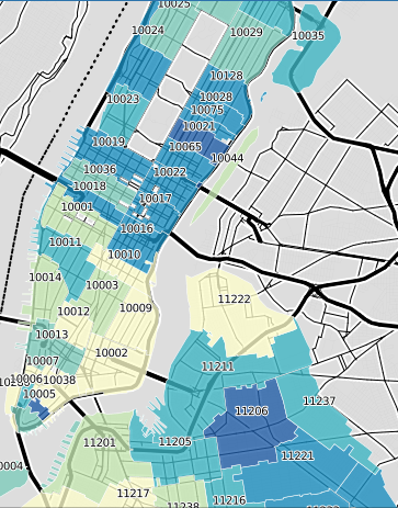
Once we had a ranking of the zip codes according to our algorithm, we used the turnstile swipe volume data to order the stations within each zip code. For instance, our highest-scoring zipcode of 10010 had two stations: 23rd st N and 23rd st 6. Union Square has a higher volume of traffic than either of these, but ended up in third place because its zip code ranking was lower.
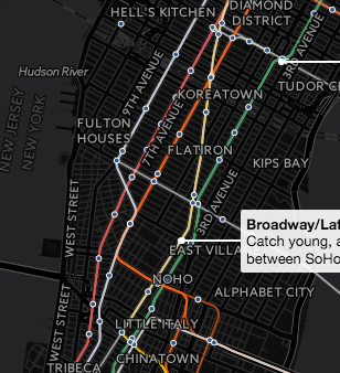
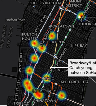
My favorite part of the week was seeing what some of the other teams did. For instance, Bryan Bumgardner and his team created a beautiful time-series visualization* of traffic using CartoDB.
While almost all teams used income data, Andrew Sherman-Ash and his team created an awesome chart* using CartoDB as well, comparing median income to amount given to charitable donations. This created a chart of charitable donations as a percentage of median income, painting an interesting perspective of the data. It was a creative insight that made me think about the data differently. A screenshot of the chart is below.
Both of these interactive charts really added another dimension to the analysis and presentation, and I was impressed with what each of my classmates came up with. I look forward to learning more about presentation and visualization techniques, and hope to get a chance to play around with CartoDB myself. Until next week!
-Em
* To view the interactive charts on CartoDB, click here and here.